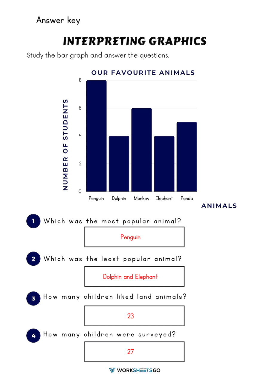
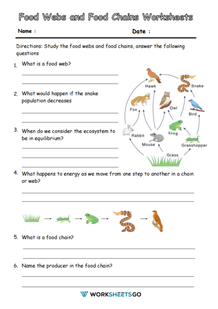
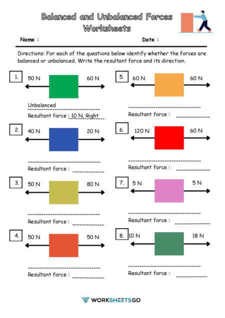
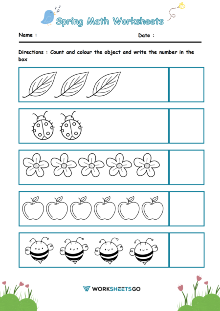
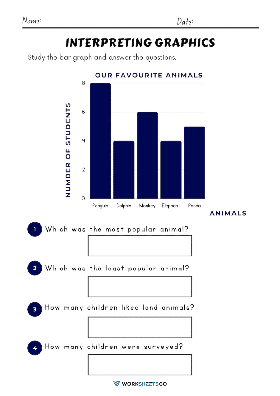
In your worksheet, there is a bar graph that shows the number of students and their favorite animals. Each animal has its own bar, and the height of the bar represents how many students chose that animal as their favorite.
So, for example, if the bar for monkeys is taller than the bar for pandas, that means more students chose dogs as their favorite animal. The numbers at the bottom of the graph tell us exactly how many students chose each animal.
Interpreting this graph means looking at the information and drawing conclusions from it. You can answer questions like “Which animal is the most popular among the students?” by reading the graph and comparing the heights of the bars.
Answer Key
